Monday, July 23, 2012

Take a Spin Card MDS Tutorial

Todays card features the Take a Spin digital stamp set.  This set is great because it has two main graphics (one of which I used for the card below) plus each of the images that make up the main graphics as individual stamps.   Very versatile!!
I had this card printed through Stampin' Up's professional print service then added the arrow with a brad so it can be spun to any of the spaces.
Now for the step-by-step tutorial to make it!

1.  Open a new project and select the 6" x 6" greeting card.
2.  Choose a background color.  (I used So Saffron.)
3.  Add the main stamp image from the Take a Spin digital stamp set.  Make sure you have the Card Bleed guide turned on.  (Seen as the grayed outline around the outside edge of the card.)  Resize the image to fit the card front keeping it inside the bleed area.
2.  Add a square punch and resize it to cover the image as shown.  Fill it with color (I used Cherry Cobbler) and send it backward.  This will make all the little dots colored.
3.  Add another square punch and resize it to cover the bottom half of the graphic as shown.  Fill with Designer Series paper.
4.  Repeat for the upper half of the card.
5.  Send both rectangles backward behind the graphic.  (I changed the upper DSP from the above picture and forgot to take a screen shot but you get the idea!)
6.  Add the triangle Petite Pennant punch.  Double click on it to open up the punch setting window.   UNCLICK THE KEEP PROPORTIONS BUTTON.  Resize the height and width to 3.56 and 2.1.   Center the punch over the graphic as shown.   Copy and paste this punch.  Flip it over and cover the bottom triangle as well. (Not shown in the picture below.)


7.  Fill both triangles with DSP and send them backwards.
8.  An optional step is to use punches to fill some of the little spaces with color like I did with the dots on the party hat, the candles, and the present.  These are pretty tiny and take some patience to fill in.   You could fill these in with a marker once it is printed.
9.  After the card is printed add an arrow and brad as a spinner.

Sunday, July 15, 2012

A Reason to Smile

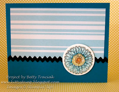
One layout- two cards- both with the daisy image from A Reason to Smile stamp set today.
I made the blue themed one first using Comfort Cafe DSP and like it so much I made a pink one with a stamped background layer.
For the focal image I stamped the daisy on Very Vanilla cardstock with Black Staz-on ink and the colored it with markers.  I uses four shades of pink and 5 shades of yellow/orange starting with the lightest going gradually darker.

Saturday, July 14, 2012

Razzleberry Splash Dresden Card Set

My final design project for Keep Calm and UStamp On uses the Dresden Designs Big Shot die in combination with the Razzleberry Splash Simply Scrappin' Kit.
This one was really fun to design!  There are five different card folds each using the Dresden die.  It uses one half of a Simply Scrappin' Kit (with plenty of leftover pieces) so you can either make two sets or use the other half for another project.  

A full tutorial for this project is available on the Keep Calm and UStamp On member site.  Click on the Keep Calm and UStamp On blinkie to sign up!

KeepCalmBlinkie

Wednesday, July 11, 2012

Reason to Smile Card Set

Stampin' Up has a special promotional set available this month only called Reason to Smile with pretty little daisy images.  I used this set for my second project for the Keep Calm and UStamp On session.
The Reason to Smile set has both outline and solid stamps that can be used alone or in combination.   A variety of techniques are featured including same-color thumping, two-step stamping, painting with re-inkers, and re-inker color washing.

The complete tutorial is available on the Keep Calm and UStamp On member site.  Membership is  $24.99 and includes access to more than 40 tutorials!  Click on the blinkie below to sign up.

KeepCalmBlinkie

Tuesday, July 10, 2012

Daydream Medallion Photo Frames

The latest session of UStamp is live and all the projects feature products from the new 2012-2013 Stampin' Up catalog.  When I saw the new Floral Frames Framelit set I immediately thought they would make great picture frames and the Birds of a Feather Designer Series paper would be pretty for a wedding theme.  So....


I created a series of three frames and a pop up easel card that folds flat and will fit in a regular size envelope.  These could be used for so many occasions.  By changing the papers and colors you could have an entirely different look!

A complete tutorial for this and more than 40 others can be found by joining UStamp with Dawn and Friends!  Click on the blinkie below to sign up!

KeepCalmBlinkie


Wednesday, July 4, 2012

Pride and Freedom

Happy 4th of July!  I hope you are enjoying a wonderful day celebrating the freedoms we have in our great country!
I celebrated this morning by taking a bit of time for some crafting and made this patriotic frame.  It is TOO HOT to do anything outside today!  It is so hot and dry that most of the local fireworks have been postponed.  We have some family activities planned for later--I think ice cream sundaes will be part of the festivities!

I used the My Digital Studio Pride Designer Template to make this.  I changed it by deleting everything except the large red words.  I printed that on Whisper White and used it for the base.  Then I printed the entire template again (I changed the quotes and phrases to Midnight Muse first) and cut out a few phrases, rearranged them and popped them up on dimensionals.

I added some stars with Cherry Cobbler Dazzling Details accents and retired ribbon at the side.

Enjoy your day!!