Tuesday, March 30, 2010

Shading with Stencils and Woven Ribbon Frame Tutorial

Today I have a very pretty home decor project to share.  I had a difficult time photographing this to show it to it's best advantage.   It uses the Folk Flowers stencils from the occasions mini catalog and the gorgeous Soft Suede grosgrain ribbon.  

With stencils it is so easy to add subtle shading to a design.  Using a sponge dauber, colors naturally blend from one to the next creating a gradient of colors.  I was also experimenting stenciling on vellum and will be posting those projects soon.  The softness of the shading on vellum is so lovely!  For today's project I stenciled on Sahara Sand cardstock to create bolder colors to coordinate with the darker frame.

The frame is an inexpensive square wooden frame.  The polka-dot ribbon is reversible which when woven creates an interesting pattern.  The texture is just yummy!  The design in the center is removable so I plan to make other fun focal images to be able to change this frame to fit the seasons.

A couple small tips for using the stencils: 
1. Secure cardstock to stamping surface with tape or temporary adhesive.  
2. Position stencil over paper. (Easy to do because the stencil is see-thru.)  Tape the edges of the stencil to hold it in place.
3. When shading the design, start outside the cut area of the stencil and begin to swirl the dauber on the plastic, gradually moving into the cut out areas.  (You can see below the ink on the edges of the stencil.)
4.  Concentrate more ink at the edges, lessening the pressure on the dauber as you move inward.
5.  Start light and add more ink as you go.  It takes very little ink to color the images in small areas.
Here is a close up of the shading:

Woven Ribbon Frame Tutorial:
1.  On the front of the frame, mark the center of each side with small pencil marks.
2. Cut four one-inch sections of Sticky Pages the width of the frame. Apply to back of frame along outer edges.  Peel the backing from the top section only. (Remove the backing from the other sections as you get to that section.) 
3. Cut lengths of ribbon the width of the frame plus 2 inches.  Stick ribbons to back of frame starting at the top center.
4.Working from the center out, adhere strips of ribbon to back frame keeping ribbons close together but not overlapping.  Flip every other ribbon over to alternate plain with polka dots.
5.  Work all the way across the top adding longer ribbon lengths at sides.
6. Apply small pieces of Sticky Pages to the corners on the back side.  Add first horizontal ribbon to this piece.
7. Add a length of sticky strip to the front of the frame as shown.  
8. Remove backing from sticky strip and fold down every other ribbon.
9.  Bring horizontal ribbon to the front.
10.  Add another row of sticky strip, remove backing and fold remaining ribbons down.
11.  Continue adding rows of sticky strip and weaving ribbons until you reach the bottom of both narrow sides.  
12.  Add more short ribbons to bottom section and continue weaving to bottom of frame.
13.  Wrap all loose ribbon ends to back and secure with additional sticky strip.

Supplies:  Folk Flowers, Sahara Sand cardstock, Soft Suede, Bermuda Bay, and Bravo Burgundy classic ink, sponge daubers, Soft Suede polka-dot ribbon, Sticky Pages, Sticky Strip, purchased frame.

Friday, March 26, 2010

Bugs and Kisses Mom and Me Projects

I had a fun surprise this morning.  My project is today's feature on UStamp! (Even the designers do not know just when our projects will be posted so it is always fun to see whose project is up for the day).

It is a collection of spring break projects using the Bugs and Kisses stamp set.
It is never to late to sign up for UStamp!  You can join anytime.  To get the complete tutorial for these projects plus LOTS more see the UStamp site here.

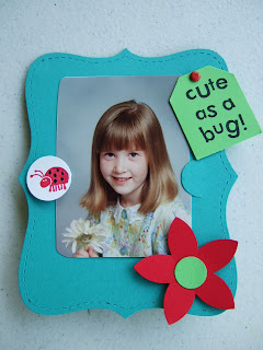
I have an additional tutorial that coordinates with this set.  This  picture frame is one that I created for a challenge on the Stampin' Up demonstrator website a while back.
Instructions for Top Note mini picture frame:
1, Cut two Top Notes from Bermuda Bay Cardstock.
2.  Score one Bermuda Bay Top Note one inch from end.

3. Using Slit punch, punch second Bermuda Bay Top Note a short distance from the edge.

4. Stamp ladybug in Real Red on Whisper White.  Color spots with Basic Black Stampin’ Marker.  Punch with 3/4” Circle Punch.  Adhere to slit punched area of Top Note on left.
5.  Punch 1/2” Circle from Gable Green.  Adhere to Real Red 5-petal flower.  Adhere to lower right corner of Top Note.  Adhere low so photo can be removed.
6. Stamp “Cute as a bug” in black ink on Gable green cardstock.  Punch with Small Tag Punch.  Attach to upper right with Real Red Brad leaving room to remove photo.
7.  Slightly bend first Top Note on the score line.  Do not over crease this fold.  Apply adhesive to one inch portion and adhere to back of decorated frame.
  
Supply List:

Paper:
Bermuda Bay cardstock, two 4”X5” pieces, cut with Top Note die
Real Red cardstock- for punching
Whisper White cardstock-for stamping and punching
Gable Green cardstock for stamping and punching

Stamp sets:
Bugs and Kisses

Ink:
Basic Black Classic Stampin’ Pad or Jet Black Staz-on Ink Pad
Real Red Classic Stampin’ Pad

Accessories
Slit Punch
Small Tag Punch
5-Petal Flower Punch
1/2” Circle Punch
3/4” Circle Punch
Black Stampin’ Write Marker
Bold Bright Brads – one Real Red
Stampin’ Dimensionals

Monday, March 22, 2010

My Digital Studio Heart Favor Box Tutorial

I am on a roll with My Digital Studio!  Today I have another great 3D project and tutorial.  Near Valentine's Day I picked up some chocolates in a cute little box with a heart on top.  I had to see if I could recreate something similar with MDS.  It worked!
The really nifty thing is this little box can be personalized with text or pictures.  Wouldn't these be the cutest little wedding shower favors?!
 Slits in the hearts slide together and hold the box closed.
 To make this I first created a template that can be used over and over, then added all the fun colors and pictures.  On this one I added photo boxes but it would be easy to put text boxes on the sides as well.  I added text to the inside flaps so there is a little message when the box is opened.

This is my finished template:
To make the template:
1. Open 8-1/2 X 11 landscape album - choose "create your own" - "blank page"
2. Add a square punch and resize to 2" x 2".
3. Working from left to right in the center of the page copy and paste boxes in a line leaving a small margin between each.  Use the align function to make sure they are perfectly aligned.
4.  Add another row of punches below the center row.
5.  For the top row add a 1" X 2" rectangle punch, a 2" X 2", a 1" X 2" and another 2" X 2" punch.
6. Add two heart punches, rotate one 90 degrees and one -90 degrees.  Position on top of 1" X 2" rectangles.  Enlarge the hearts to match the size of the rectangle.  
7.  Send the heart punches to the back.
8.  Add square punch and resize to 1/2" X 2".  Move to left side of middle row to form tab.
9.  Add a photo box, resize, copy and paste 3 more and move into position.

This is the template.  Make sure you save this!  Make a duplicate before moving on the next step.


10.  Decorate as desired.
11. Add mats to middle row of punches to fill in the in-between spaces.
12.  Print on Whisper White cardstock.
13.  Cut out and score on mat lines.

You can find more tutorials and ideas for things to do with My Digital Studio HERE.

Sunday, March 21, 2010

Custom My Digital Studio Bookmark Tutorial


I have had requests for more 3D My Digital Studio projects.  This tutorial will show you an easy way to make personalized bookmarks. Once you have a template made, you can make these very quickly.  
The images are photos taken of flowers in our garden last summer.  I am so looking forward to spring – the tips of the tulips are starting to peek out of the ground so I now it really is coming!


First I created and saved a template.  Then added the background paper from the lovely Shades of Spring collection, the photos and Bible verses.
1. Open a new project – 8 ½ X 11 album landscape – design your own – blank page.
2. Add a square punch and resize to 2" X 6-1/2".
3.  Move punch to left side of page leaving 3/8" margin at left edge of template.
4. Copy and paste 4 more rectangles.  
5. Using align functions position rectangles on page leaving a very small margin between each.
6. Add a photo box and resize to 1-1/2" X 1-1/2".
7. Position photo box at top of rectangle.
8. Copy and paste 4 more photo boxes and position each in a rectangle.
9. Add a text box and resize to 1-1/2" X 4".
10. Copy and paste 4 more text boxes and position in bottom of each rectangle.

Once your template is made be sure to save it.  I keep a blank template in the project file and use the "insert" - "duplicate page" function to add the page on which I will add the background dsp, pictures and text.

11. After adding papers, photos and text print it on Whisper White cardstock.
12. Cut out bookmarks.
13.  Mount each on a piece of 2-1/4" X 6-3/4" coordinating cardstock.

You can find other My Digital Studio tutorials, tips and tricks HERE.

Saturday, March 20, 2010

Mini Box Stamp for My Digital Studio

SU! has a new mini stamp set for My Digital Studio for making mini boxes.  This is the pillow box.
I have a couple of tips for using it.

First of all,  when you download the set, the boxes will be under "Stamps"- Mini Project Boxes.  The papers will be under "Designer Paper" - Mini Project Boxes.  They also are found under Multiple Output Options - 8-1/2 X 11 portrait- designer templates.  In this location the paper and box are already combined.  I prefer using it as a stamp and choosing my own paper.

For this project:

1. Open a new project - 8.5 X 11 album- either landscape or portrait will work.  Choose blank page.
2. Add a background paper - I used the Shades of Spring dsp.
3. Add the pillow stamp.  Rotate 90 degrees if necessary.
4.  Add any text or images at this time if you are using them.  I did not for this first project.
5.  When done change the color of the stamp to a shade matching but slightly darker than the background.
6.  Print on Whisper White cardstock.
7. Use the faint lines to cut out the box.
8. Cut the slit using a hobby knife.
9.  Score the fold lines.  I used my scoring blade for the straight lines and a stylus for the curved lines.  (Put a mouse pad underneath when using the stylus.)
10.  Fold and decorate.

If you are used to using the Big Shot Pillow Die this will seem like a lot of work.  The Big Shot does all the cutting and scoring for you.  But the perk of doing this on MDS would be the ability to add custom text and pictures to make personalized favor or treat boxes.

Thursday, March 18, 2010

Altering My Digital Studio Background Paper Tutorial

Tom and I have been away for a short vacation in sunny (though not necessarily warm) Arizona.  We flew into Phoenix (warm) and drove to Flagstaff (cold).  It was 9 degrees the first morning!  We took a train from Williams to the Grand Canyon for our first day.  What a beautiful sight!

Later in the hotel I was making this quick little scrapbook page on My Digital Studio and discovered a neat trick for altering background paper to give it a more subtle look. 
I liked the color of the designer paper from the new Shades of Spring collection but thought the floral design was a bit distracting from the photo and text so I added an overlay to tone it down. 


Here is a short tutorial of what I did. 

1. Open a new project (in this case a 5X5 album) and choose “create your own” and “blank page”.

2. Add the brown Shades of Spring dsp as a background.

3.  Next click the “add as Page Layer” box and add the same dsp to the project. 
4.  Double click on the layer and drag the crop box to enlarge the crop area until it is large enough to cover the entire 5X5 background square. 

5. Position the second layer over the first.

6. Reduce the opacity to desired level – in this case to 30 giving a softening effect to underlying paper.

Here are the before and after shots of the paper – just enough change to keep the background paper from overpowering the main focal image.
Before:

After:

I really like this simple subtle change and plan to experiment with other background papers to see what they look like using this technique.

Thursday, March 11, 2010

Scrap Card and Blog Candy Winner

Just a quick card today.  I had a lot of interesting scraps on my table from other projects.  Putting them together made a quick but I think rather fun card.

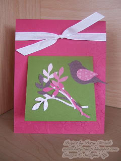
I dry embossed the Rose Red base with the Elegant Bouquet Impression die.   The Old Olive is 3" X 6", scored at 3" and adhered to the front as an extra space for a greeting.  

All the paper patterns of the Sweet Pea collection mix and match so well it is easy peasy to make them look pretty!

Supplies:  Paper- Rose Red, Old Olive, Sweet Pea DSP.  Ink-Old Olive.  Punches - 2-step Bird, Wide Oval, Large Oval, Heart to Heart.  Accessories - Elegant Bouquet Impression Die, White Taffeta ribbon

Thanks for your comments this week.   I appreciate your suggestions for MDS projects.   Little by little I will be adding tutorials for more projects.  MDS tutorials take me a bit longer to do than card tutorials.  

I entered all the comments on random.org and it chose Marsha as the winner.   Congratulations Marsha!  Please email me at kittystamp7@yahoo.com and I will get you all set up to join UStamp Spring Soiree.
  

Tuesday, March 9, 2010

More "Monster" Cards

Two more business size cards to share today.
These really were a breeze to make - the only trick was adjusting the cuts on the main paper to ensure the focal point was centered and not cut part of an image off.

Cutting details:  Base is 8X9.  Scored at 4.  Folded to form 4 X 9 card.  Mat is 3-3/4 X 7-3/4.  Focal layer is 3-1/2 X 7-1/2.  For the last card pictured I cut the layers slightly smaller to accommodate the image.
Blog Candy info:


The time is approaching for the next round of UStamp to start with all new (and I have to say AWESOME projects) for spring.  As a designer, I get a sneak peak at the new projects and WOW! what a bunch of talent and enthusiasm!  It all starts in just 9 days!!  And you have a chance to win a FREE PASS to UStamp by leaving a comment on one of my posts this week.  I would especially be interested in what you would like to see me post about My Digital Studio.  I am working on lots of goodies that I will be sharing but I would like to know what you are interested in learning.  You can click here to see past MDS tutorials.

I will pick a random winner on Wednesday March 10.

Monday, March 8, 2010

Monster Size Cards

One of the things I love about doing design work is looking at a product and then letting my mind mull over various ideas to best show it off.  I keep a sketch book handy as I browse through the catalog or I lay out different products and start to visualize the possibilities.

The Sweet Pea Paper stack has a rich variety of patterns.  As I tried to picture using the big bold patterns, I thought of using them as the focal point for large cards.  I designed these to fit in a regular business size envelope.  I LOVE the way they turned out.  It is a good feeling to have an idea and then see the finished product turn out even better than expected.  (This does not always happen - I have some ideas that find the wastebasket to be their new home.)

Here are a few of them:
The inside of the above card says "Happy Bird-day" printed with My Digital Studio.
The cloud has the sentiment "friend to friend" stamped on a cloud that is cut out and popped up on dimensionals.
After making so many 3X3 cards lately these seem like they are monster-size!  I have a few more to share tomorrow plus cutting directions.

Also don't forget to leave a comment to be entered for the blog candy!
The time is approaching for the next round of UStamp to start with all new (and I have to say AWESOME projects) for spring.  As a designer, I get a sneak peak at the new projects and WOW! what a bunch of talent and enthusiasm!  It all starts in just 10 days!!  And you have a chance to win a FREE PASS to UStamp by leaving a comment on one of my posts this week.  I would especially be interested in what you would like to see me post about My Digital Studio.  I am working on lots of goodies that I will be sharing but I would like to know what you are interested in learning.  You can click here to see past MDS tutorials.

I will pick a random winner on Wednesday March 10.