Saturday, October 30, 2010

Halloween Treats

I wanted to make a little box for some mini chocolate bars to send my grandma and made the happy discovery that the scallop envelope die makes the perfect sized box.  
I cut two envelopes from black cardstock, bent the bottom flaps backwards and adhered them together to form the bottom of the the box.  Then I cut two rectangles of cardstock for the sides and stuck them to the side flaps.  Instant box!  I used some scraps of things left from my last projects to decorate the front and back.  Mini Hershey bars line up perfectly inside.

I was sorting craft supplies today and found some mini lunch bags.  Since there were still scraps left on the table I made two ultra quick goodie bags.  Literally 3 minute projects.
I stuck a length of sticky strip down the center of the bag and scrunched up some black waffle paper and snipped the edges.   
I have now successfully used up the last of the pumpkins I had printed with My Digital Studio.   I always feel better when I can use some of the cute leftovers for another project.  

Thursday, October 28, 2010

Spooky Things Luminary

Today I have my last project using the Spooky Things vinyls.
This luminary was easy to do.  I started with four sheets of 8 1/2 X 11 inch black cardstock and scored each 1/2" from the left edge.  Then I used the Fiskars paper cutter to cut a rectangle out of each leaving a 1 inch border on the sides and 1 1/2 inches on the top and bottom.
I cut the vellum cardstock one inch larger than the opening and applied the vinyl graphics to each.  I used my handy dandy grid paper behind the vellum to help align the images.  The spider web is just a line drawn with a black marker from the "3" to the spider.  I used glue dots on the edges of the vellum to adhere them to the frames.
The last step was to attach the four pieces together using sticky strip.  A candle in the center does make this thing look spooky!

Monday, October 25, 2010

Halloween Picture Frame

This is my favorite project I have made recently.  Unfortunately, it is the worst photography I have done in a while.  I just could not get this to show up anything like it does in person.  So you will just have to take my word for it that this is totally cute and much brighter than it appears.
I started with a black edged float frame and applied the "happy halloween" vinyl.  I used a piece of grid paper inside the frame to make sure it was aligned properly.  This one was pretty big so I enlisted Tom's help to get it in the correct spot.  An extra pair of hands was much appreciated when dealing with the sticky vinyl!   Then since he was handy I asked his advice on the background paper and he suggested an oval with stripes.  (Just what it needed and I would not have thought of that one!)
By then we were having so much fun working on this that we kept going and both chose the pictures to add to the frame.  Maybe that is why it is one of my favorite projects - not only does it have great pictures of the kids, we had a great time doing it together.

Friday, October 22, 2010

Fall Gum Wrappers

These are quick little wrapped gum treats that I made for Leah's class.
The More Mustard striped paper is from the Rich Regals DSP pack.  I printed the names using My Digital Studio on Very Vanilla and mounted them on a black piece punched with the Modern Label punch.  The acorn is from the Day of Gratitude stamp set (which I LOVE!) and tied with linen thread.
The DSP is 2"-1/4" X 2- 3/4", scored 3/4" apart.  A line of Sticky Strip is necessary for this to hold together well.


Tuesday, October 19, 2010

Trick or Treat Decor Elements Frame

This Halloween frame is made using the Spooky Things vinyl Decor Elements collection.  
The frame is a 6 X 12 glass insert frame.  To make sure I got the vinyl letters positioned in a straight line I cut a piece of grid paper to fit and put it behind the glass.  I was then able to line up the letters and mark the edges of the backing paper before peeling away the liner.
This shows the lettering once it is applied to the glass.  I added a row of black rhinestones at the bottom.
I cut a 6 X 12 inch piece of More Mustard DSP (from the Rich Regals stack)  for the base and mounted a cutout photo.
The pumpkins at the side are done with My Digital Studio.  They are from the Calendar Basics stamp set. (When making the row of pumpkins, I used the "Snap to Grid" function to get perfect spacing)  I printed them on my home printer on matte photo paper and edged the strip with the Black Raven 1/2" Lace Trim.
There are many more vinyl images that came with the set so I hopefully will be sharing more projects with them soon.  

Monday, October 11, 2010

My Digital Studio Santa Owl Tips and Tutorial

As promised, here are some tips for making the Santa Owl found HERE and a step by step  tutorial as well.

RESIZING THE OWL:  The pieces of the owl punch are each separate so color or paper can be added to each.  When I want to change the size of the owl I have found it easiest to double click on each piece to bring up the "object settings" function and with "keep proportions" box checked I change the size of each piece by a multiple of the length or width.
For example if I want the pieces to be 4 times the original size, I take the height (22) and multiply by 4 to get the resized number (88).  

I do this for each piece of the owl as I am adding it and then all the pieces are perfectly sized.

MAKING SNOW:   To make the snow drifts at the bottom of the page, I resized a square punch to make a rectangle at the lower edge of the page and filled it with whisper white.  Then I added a "hand-torn" stamp from the Torn Edge stamp set, flipped it over and filled it with whisper white. 

For those who are interested here is the step by step tutorial to make this layout.  I made this 12 X 12 but you could adjust it to whatever size you choose.

1.  Open a New Project - Photo Album- 12 X 12 - Create Your Own- Name Your Project.

2.  Choose the 1.25 Square Punch and stretch it to cover the entire page.  Paper fill with DSP from the Elegant Soiree' download.  Reduce the opacity to 50.

3. Add the 1.25 Square Punch and stretch it to form a rectangle at the bottom of the page.  Fill with Whisper White.

4.  Add the Hand Torn stamp, flip and fill with Whisper White.

5.  Add the line of circles for the owl to sit on.  It is found in the embellishment section of  Christmas Cocoa - Elements.

6. Add and resize the owl pieces.  (Quadruple the size for a 12 X 12 layout.)  Fill with Soft Suede for the body, Christmas Cocoa DSP for the belly, Whisper White, Baja Breeze and Black for the eyes.

7.  For the hat, add a Full Heart Punch, enlarge and flip.  Color Fill with Real Red.

8.  Add a Modern Label Punch, enlarge and fill with Whisper White.

9.  Add two snowflake punches and fill with Whisper White.

10.  The tree and gift are stamps from the Calendar Basics set -colored Soft Suede and Real Red, respectively.

11.  The sentiment is from A Holly Jolly Christmas Stamp set and colored with Soft Suede. 


Friday, October 8, 2010

Santa Owl and Blog Candy winner.

Punches are my favorite tools whether they are actually hand held ones or virtual ones on My Digital Studio.  I get such a kick out this owl punch.  The santa hat is the Full Heart punch flipped upside down with the  Modern Label punch for the brim.   I will add a tutorial for how to do this page another day but for now here is the little jolly santa owl.

EDITED:  THE TUTORIAL FOR THIS CAN BE FOUND HERE.

Also the winner of the free pass to the "Get a Jump on Your Jingle" UStamp session is jmniffer.
I used random.org and entered the names as you can see here.
  1. jmniffer
  2. Marsha E
  3. paper bag create
  4. MaryR
  5. Kim W
Timestamp: 2010-10-08 03:28:17 UTC
Jmniffer please email me at kittystamp7@yahoo.com with your email address and I will give you all the details!  

Wednesday, October 6, 2010

Spooky Halloween Card Tutorial

Don't forget to leave a comment on this post or Monday's post for a chance to win a free pass to the Christmas session of UStamp- Get a Jump on Your Jingle!

I downloaded the bat punch for My Digital Studio last night and then started thinking about an idea for a spooky looking card.   This is what I came up with:
The center photo is a picture of pumpkin we carved several years ago.  The original photo is not that spectacular.  It was taken as night and is a bit fuzzy.  But by using the Photo Effects function I was able to easily change it to something rather fun.

There are several different techniques I used for this so I thought a tutorial might be helpful.
1. Open a New Project - Greeting Card - 7 X 5 Landscape - Create Your Own - Name your project -Blank Page.

2. Under stamps select Vintage Overlays (purchased download).  Choose the third one down and cover the background.

3. Choose the 1.25 Square punch and stretch it to cover the entire card.  Paper fill it with Basic Black Grid Designer Series Paper (this comes with the MDS program).  Reduce the opacity to 40.

4. Add a photo box, enlarge it to size and use the Photo Shape button to change it to a circle.  

5. Add a photo.  Using the Photo Effect function choose Negative to alter the picture.

6. Add a bat punch.  Double click on the bat to bring up the Object Settings box.  Make sure the Keep Proportions box is checked and change the width to 913.  Reduce the Opacity to 55.  Center it horizontally using the Arrange - Align - Center on
Page Horizontally function.

7. Add the flourish stamp from the Extreme Elements set (comes with the program) to the page.  Change the size to width 185 (with the Keep Proportions box checked again).  Reduce the opacity to 75.

8.  Copy and paste the flourish 3 more times.  Rotate each 45 degrees.  Position one in each corner.

9.  Add a text box and type the greeting.  I used the color picker to select a blue from the pumpkin.  The font that I used is one that came with Word for Mac called Cracked.

Monday, October 4, 2010

Free Standing Pop up card and Blog Candy

I love the sentiment that comes with the Day of Gratitude stamp set.  I had been wanting to make some sort of frame or picture with that sentiment to set out for fall.  When I saw Gilda Fellows free standing pop up card on UStamp I just had to give it a try.
The Autumn Spice Speciality DSP worked nicely for this as it is a heavier weight.  I really like the how this thicker paper looks when punched- like a nice quality die cut.
The large medallion is handcut from the paper.  I am always amazed how adding little touches like pearls instantly dresses up a project.
I have so many things to be grateful for!!!
Also you can leave a comment on any post starting today through Thursday Oct 7 to be entered in a random drawing to win a free pass to the Christmas session of UStamp!  Designers are working on an amazing collection of gifts, cards and decorations.  You can read all about it HERE or click on the Jump On Your Jingle Blinkie on the side bar.  Be sure to check back on Oct 8 to see if you are the winner!

Saturday, October 2, 2010

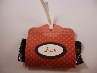
Quick Candy Bar Wraps

Leah is part of a Classical Conversations homeschool class this year.  They meet weekly for teaching, science experiments and discussion.  (Her favorite subject is Latin.)   These are the first of little treats I plan to make throughout the year for the students.
I used My Digital Studio for the names so the colors would match.  I printed them on Whisper White paper and punched them with the small oval punch.  Then layered on a Large Oval punched from Early Espresso.
The base is cut with the Two Tags Big Shot die from the Rich Regals Patterns DSP pack and the ribbon is 1/8" Very Vanilla Taffeta.  The perfect size for mini Hershey bars!

Edited:  I had a question about the type of candy I used.  This are the "SNACK SIZE HERSHEY MILK CHOCOLATE" bars.