Sunday, August 3, 2014

Stamp Review Crew: Flower Patch Edition

Members of "The Crew" were excited to have been chosen to create projects for one of the display boards at the 2014 Stampin' Up! Convention in Salt Lake City which was held in mid-July.  We chose two stamps for our board: Lovely as a Tree and Flower Patch.  This current blog hop has all our Flower Patch projects. 

Several months ago I started creating animals with the Hamburger Box die and had thought a turtle would be cute.  As I was brain storming ideas for the Flower Patch set I realized the leaves could become flippers and a sea turtle was born.  The spotty Flower Patch images fit perfectly in the embossed hexagons to give this little gal some shell flair.
I guess I still had critters of some sort on my mind when I created my next card with this awesome little fellow.  
Finally, I used the flowers as.... flowers!    It is wonderful how all the images and framelit cutouts layer on one another.    The flower pot was made using the French Fry Box die.
From the side you can see that it is curved and mounted at the edges only to give some added dimension.

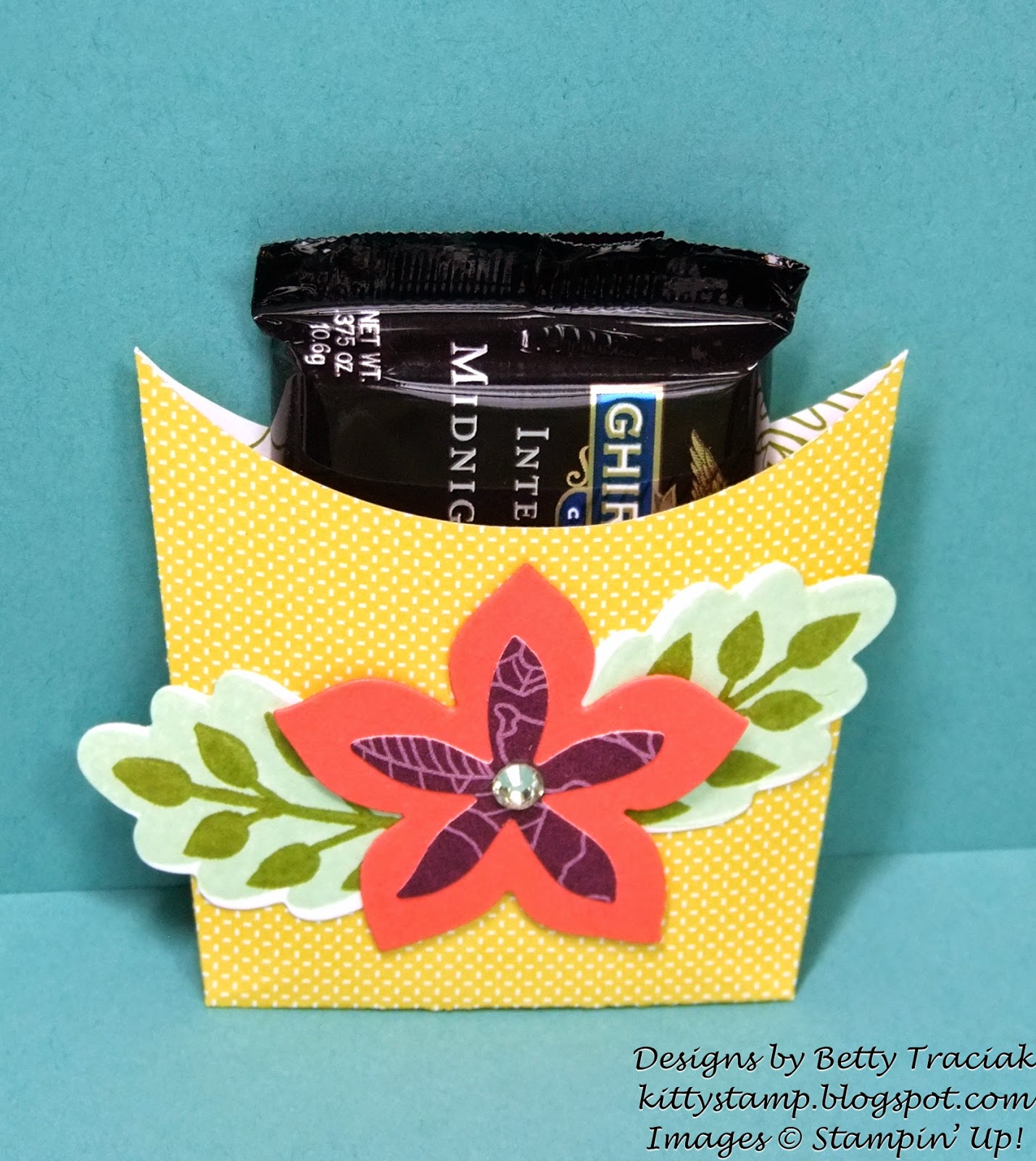
I had some pieces leftover from experimenting with layouts for the other projects.   They were too cute to throw away so I combined them to make a little Ghirardellie chocolate holder.
Here is a pic of the completed display board with all the super projects!
Thanks for stopping by!   To see all the Flower Patch beauties displayed please click on the buttons below to continue with the hop or you can click HERE to see the complete blog roll.  


Hamburger Box Sea Turtle
Stamps: Flower Patch
Paper: Mossy Meadow, Pistachio Pudding, Pink Pirouette, Basic Black
Ink: Blackberry Bliss, Pistachio Pudding
Big Shot: Hamburger Box Die, Flower Flair Framelits, Honeycomb Embossing Folder
Punches, ½” Circle, ¾” Circle, 1-3/4” Circle
Accessories: Chalk Marker, Tombo Adhesive

Awestruck Card
Stamps: Flower Patch
Paper: Park Lane Designer Series Paper, Whisper White, Basic Black
Ink: Blackberry Bliss, Calypso Coral, Daffodil Delight
Big Shot: Flower Flair Framelits, Project Life Cards and Labels Framelits
Punches, ½” Circle, ¾” Circle
Accessories: In Color Sequin Assortment, Tombo Adhesive,  Stampin Dimensionals


French Fry Flower Pot Card
Stamps: Flower Patch
Paper: Park Lane Designer Series Paper, Blackberry Bliss, Mossy Meadow, Calypso Coral, Old Olive, Whisper White, Basic Black
Ink: Blackberry Bliss, Old Olive
Big Shot: French Fry Bigz L Die, Flower Flair Framelits, Project Life Cards and Labels Framelits
Accessories: Fringe Scissors, Basic Rhinestones, Tombo Adhesive, Stampin Dimensionals

Tuesday, June 10, 2014

Purple Perfect Peacock

Purple Perfect Peacock... that is a bit of a tongue twister!   Now I know that peacocks are not really this color but it is fun to come up with different color combos using the Blendabilities markers.
I love the combo of Rich Razzleberry marker with the Blackberry Bliss paper from the Park Lane Designer Series Paper.  When looking through papers in the new catalog the one that really attracted my attention was this dark purple floral design.  So it was a natural choice that my first card would include it.

The detail in the Perfect Peacock stamp is incredible!  So fun to add layers and layers of color. If you click on the photo it will enlarge to see the color gradient and variation a bit better.
I used the Blendabilities markers for several other things on this card as well.  The "bow" is white ribbon that I colored with the darkest Coastal Cabana marker and then pulled apart the strands.
And the rhinestones are colored with the darkest Rich Razzleberry marker.
I thought the sentiment from the Flower Patch photopolymer stamp set fit this card BE YOU TIFULLY!

Supplies:
Stamps:  Perfect Peacock, Flower Patch
Ink: Memento Tuxedo Black, Tempting Turquoise Classic, Blendabilites: Coastal Cabana, Rich Razzleberry, Daffodil Delight and Old Olive
Paper: Whisper White, Park Lane Designer Series Paper
Big Shot: Project Life Cards and Labels Framelits
Accessories: Basic Rhinestones, 3/8" Whisper White Taffeta Ribbon (retired)

Tuesday, May 20, 2014

Swallowtail Celebration

The vibrant colors of the Blendabilities markers make this butterfly look so lifelike.
For something different on the card front I trimmed the butterfly along the right edge.  Because the markers do bleed through to the other side, I added a second full layer of Whisper White cardstock on the inside that is trimmed just a smidgeon smaller than the original layer.  This also made the card a nice heavier weight as just a single layer of Whisper White is fairly thin.

The sentiment is stamped on the inside layer.  I was looking for a birthday-type sentiment with a pretty font and I came up with one from the long retired Send A Celebration set.   This set has some line images that would be great colored with the Blendabilities so you may be seeing some more cards from this set in the future.

This is the back of the card.  It is a bit easier to see the cut away from this view.
Supplies:
Stamps: Swallowtail, Send A Celebration (retired)
Paper: Whisper White
Ink: Memento Tuxedo Black, Blendabilities (Cherry Cobbler, Pumpkin Pie and Daffodil Delight assortments)

Sunday, May 18, 2014

Stamp Review Crew: Wetlands Edition

Welcome to the latest Stamp Review Crew Blog Hop.  At each stop you will see ideas using the Wetlands stamp set.  We have our blogs permamently linked in a circle but if you encounter any difficulties just click on the banner above to be taken to a complete list of Stamp Review Crew members and blog links.

For my project I paired the nature-themed Wetlands stamp set with two NEW In-Colors, paper from a NEW Designer Series Paper Stack, a NEW stamp set and a NEW Big Shot die all of which will be available beginning June 1 in the NEW catalog.
Blackberry Bliss and Hello Honey are two of the five new In-Colors. Blackberry Bliss is a dark purple that depending on the color it is with can look very masculine or distinctly feminine.  Coupled with Hello Honey and Sahara Sand it works well for a desk set that would be great for Father's Day (even with the pink notepads!)

On the first three items below, the swashes of Sahara Sand are stamped with the wonderful new Work of Art stamp set.  I can tell already that the brush stroke images of this set will be ones that I reach for many times.
6-1/2" X 10-1/2" paper,  scored at 1 and 5-1/2" on short side,  2-1/2",  3-1/2" and 9-1/2" on long side.
Just a tiny bit of the new Moonlight Designer Series Paper Stack can be seen peeking out behind the goose on the pencil cup.  Oh and I almost forgot-- the satin Hello Honey ribbon is NEW too!  
This little paper clip holder is made with the new Hamburger Box Die.   I have been having great fun with this die and just learned a fantastic tip for assembling it from Jackie Susnik.  Instead of making the "V" fold pleats at the corners,  use a scissors to clip one side of the "V" and treat it as a tab.  Then it is very quick to fold on the remaining scorelines and adhere the tabs.  It cuts the assembly time WAY down and the tabs hold it securely.  That little tip just took this up a notch in my book!
I added a very simple post-it note holder to round out the set.
3-1/2" X 11" paper, scored at 1", 4-1/2" and 8"

Thanks for stopping by!  Please click on the "Next Blog" button to continue on to see Jill's beautiful creations or the "Previous Blog" button to view Cindy's.


Wednesday, May 14, 2014

Hamburger Box Critters - Set Three

The critter collection continues to grow!
First we have a little lady moose with dreamy blue eyes and and pouty lips.  The soft colors and tiny hearts on the new Lullaby DSP are a whimsical addition to the herd.
Next is a not-so-scary bat.  Those little fangs couldn't hurt anyone could they?
And last to the picnic is a ladybug.  The body is made with the red-checked Maritime DSP which reminds me of a picnic tablecloth.

Here are a few tips for creating each:
Moose:
For the eyelashes snip partway into a one inch wide strip of black cardstock with the Fringe Scissors.  Roll around the barrel of a pen to curl.  Glue to eyelids which are circles cut in half.


To make the lips,  use tip of the Mosaic punch to make the upper and lower lip indentions.  Use a scissors to round off the sharp edges.  Cut in half lengthwise.

Bat:
For the wings, use the largest smooth Circle Framelit.  Cut the circle in half.  Score 1/2" from the end.   Starting at the scoreline,  punch the upper wing with the Large Oval Punch and the lower wing with 1-1-1/4" Circle Punch.


LadyBug: 
The black wing section is the "leftover" piece when the largest Circle Framelit is used to cut two circles that almost overlap.  You could also use the 2-1/2" Circle Punch to make this.

Moose Punches Etc:
Eyes: Small Oval, 1/4" Circle,  1/8" Handheld
Eyelid: 1" Circle
Eyelashes: Fringe Scissors
Lips: Large Oval, Mosaic
Antlers: Autumn Accents Die
(Cardstock colors: Lullaby DSP, Rose Red, Whisper White, Basic Black, Sahara Sand)

Bat Punches Etc:
Eyes: 3/4 Circle, 1/2" Circle, 1/8" Handheld
Fangs: Petite Pennants Builder
Eyes: Small Oval, 1/4" Circle
Wings: Largest Circle Collection Framelit (cut in half), Large Oval, 1-1/4" Circle
(Cardstock: Basic Black,  Whisper White, Rose Red)


Lady Bug Punches Etc:
Head: Second smallest Ovals Collection Framelit
Eyes:  Small Oval (cut in half), 1/4" Circle (cut in half) 3/4 Circle, Owl Builder Punch (middle circle for pupil)
Mouth: Extra Large Oval
Cheeks: 1/8" Handheld
Spots: 1/4" Circle
Wing section: Largest Circle Collection Framelits.  (Could also use 2-1/2" punch)
Antennae:  Modern Label ( cut in half lengthwise), Boho Blossom
(Cardstock: Maritime DSP, Basic Black, Whisper White, So Saffron, Pool Party)

Tuesday, May 13, 2014

Blackberry Bliss and Rich Razzleberry Wedding Card

Blackberry Bliss is one of the new In-Colors and oh is it rich and wonderful!  Just the name sounds decadent doesn't it?    It is darker than Rich Razzelberry which is one of the main 40 colors in the Stampin' Up palette.

For this wedding card I used the Rich Razzleberry Blendabilities to color the image and added a touch of satin Blackberry Bliss ribbon at the side.   The darkest marker shade is very similar to Blackberry Bliss making the shading really pop.
The roses are made by twisting the ribbon and coiling it on a large glue dot.
Supplies:
Stamps: Apothecary Art, This Day Forward
Ink: Memento Tuxedo Black, Rich Razzleberry and Old Olive Blendabilities
Paper: Whisper White, Old Olive
Punches: Bird Builder
Big Shot: Labels Collection Framelits, Beautifully Baroque Embossing Folder
Accessories: Basic Pearls, Blackberry Bliss 3/8" Stitched Satin Ribbon

Monday, May 12, 2014

Traveler Graduation Card

This flip style graduation card pairs Maritime Designer Series Paper with the Traveler stamp set.  I was going to add more embellishments to the outside but decided I liked the crisp clean look of just the knot patterned DSP.
The right panel folds out to reveal a pocket for a gift card or cash and the circle flips over to display a second image.
Small strips of the nautical flag paper frame the sentiment.  The sentiment is from the retired Word Play set.  I always seem to go back to this one for graduation cards.
Sandi Maciver has a great video with directions for making the flip card.  It can be found HERE.

Supplies:
Stamps: Traveler, Word Play
Ink: Night of Navy
Paper: Whisper White, Real Red, Maritime Designer Series Paper
Punches: 2-1/2" Circle
Big Shot: Circle Card Thinlits