Just a quick post today as I am packing for the SU! Convention in Salt Lake City. Woo Hoo!! I am looking forward to meeting so many friends there and checking out all the new products.
This is the card I made for swapping. The ribbon embellishment is the 1/2" poly-stitched ribbon. I pulled a thread on one end to fray the ribbon to add some interest.
The small card pulls out to reveal the greeting and gives an extra place to write a message or add a picture.
Here is the stack ready to share with fellow stampers!
Tuesday, July 20, 2010
Monday, July 19, 2010
Tutorial for Making Business Cards with My Digital Studio
One thing I have been wanting to try is see if I could make business cards using My Digital Studio. I am happy to report the results are awesome!! It takes a while to create a template but once you have it saved you can use it over and over. The next time I make them it will be so quick! Tip: Keep images and text near the center of the card so little variations in your template will not be noticeable. I used Avery Ink Jet Matte White Perforated Business Cards.
(PLEASE NOTE-- These instructions are for a guide only. Everyone's printer is different so you may get different results when you try this. Also if you use another brand of business cards you may need to adjust your measurements. I had to play around with this a while before I was happy with it. This is how I did it and I was happy with the results.)
1. Open a New Project - Multiple Output Options - 8-1/2 X 11 portrait - Create Your Own - Name Your Project - Blank Page.
2. Add a square punch and using the rulers at the side resize it to 2" X 3-1/2". Position it in the upper left corner with a 1/8" border at the top and a 1/2" border at the side. Copy and paste this rectangle 9 more times and position on canvas as shown leaving only a tiny break in between each. (Use the arrow keys and align functions to help position them accurately.)
3. Print a draft on regular copy paper. Place it over a sheet of the business cards. Hold this up to a window or light source to see if your breaks match up to the perforations on the business card sheet. Tweak your rectangles if necessary to make them match.
4. Once you have your template correctly sized, save it and insert a duplicate page. You will now be working on the duplicate page. (The original template can be used over and over.)
5. Add desired text and and images to one card. Group elements and copy and paste it to each of the other 9 cards.
6. Delete the rectangle punch from behind each card. (These were just place keepers to help with spacing.)
7. Print on pre-perforated business cards using Best Quality on your printer.
8. Optional: Add a background color or designer paper and reduce the opacity to desired level. I chose not to use a background color or paper on this one. Depending on your printer it may not print all the way to the edge, leaving a strip unprinted at the edges of the cards.
Sunday, July 11, 2010
On Board Cog Chipboard Set
My project for the Early Summer UStamp is featured today. It is a chipboard technique class using the On-Board Cog Chipboard.
From vintage:
From vintage:
To pretty:
And just plain fun:
Thursday, July 8, 2010
Morning Coffee and Scalloped Ribbons
My brother and sister-in-law own a local coffee shop so the Morning Cup stamp set and Take a Sip Wheel were tops on my wish list from the new cattie. The fun designs in the Hostess DSP pack were just the thing to pair with the maiden voyage of these new stamps and I have been anxious to try the Dotted Ribbon Border punch as well so this was a happy stamping day!
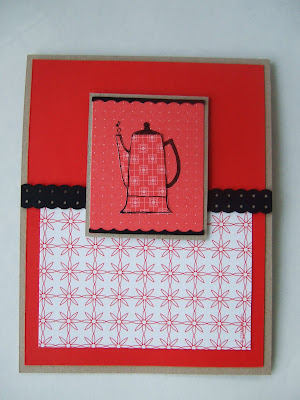
This first card is pretty simple as the bold background paper does the trick on this one. I used 1/16th inch borders for the Crumb Cake base and the black mat to keep the focus on the stripes. The teapot is paper pieced and the little black scallop underneath it is the leftover scrap you get when you punch a border with the Dotted Scallop Ribbon Punch. How cool is that! I love it when the "throw aways" turn out to be treasures. (By the way, that is a little piece of black satin ribbon tucked in at the right side of the teapot mat in the shadows. I need to work on a better photography set up.)
For this card I also paper pieced the coffee pot and used the little leftovers again. I backed the black dotted ribbon piece with a narrow strip of Crumb Cake to make the dots show up with more contrast.
The Take a Sip wheel has so many cute little cups. This is only a portion of the whole image. It is stamped with Staz-On Jet Black and colored with markers. I cut the ribbon strip down the center to frame the stamping. I have a few more ideas of ways to use the ribbon punch but that will have to wait for another day!
Wednesday, July 7, 2010
Oodles of Owls
My new catalog order arrived today and I have been playing with the goodies. First thing I chose to try was the owl punch and the Hostess DSP pack.
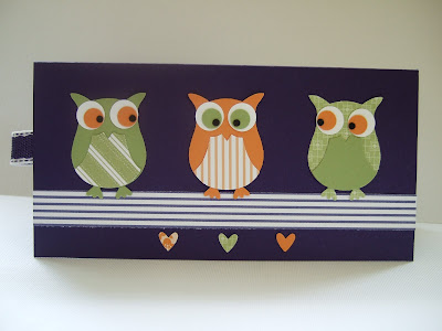
These little guys are adorable! I have to warn you though the pieces are TINY and you will have an explosion of teeny little scraps everywhere! I used tombow adhesive and tweezers to glue the eyes. I had glue everywhere except where I wanted it. As I was assembling the card, I could not find one of the 3-piece eyes. It had been right there a second ago. I looked everywhere and could not find it. I was about to punch new pieces when I found it - stuck to my elbow! Argh!!
I noticed the "tummy" piece looked interesting on its own so I started experimenting and came up with this medallion flower. I "fussy punched" each piece by turning the punch over and lining up the design each time to get the same pattern on each petal. By curving the pieces and then adhering them to a contrasting circle the center makes a very pretty design. And the flower from the Itty Bitty Punch Pack is the exact match to the flower on the DSP border! The Concord Crush Poly Twill ribbon is a rich dark purple - as yummy as it sounds. The new half pearls and a double corner punch finished this off nicely I thought.
After I finished the other two cards there were a multitude of mini circles and hearts left over. Not wanting to waste them I made this quick scrap card. The background is stamped with the new Confetti mini set.
I LOVE the hostess DSP pack!! I will be using every scrap of this to be sure.
Tuesday, July 6, 2010
Scraps and Smooch
I had multiple thin strips of Very Vanilla left over from cutting another project. Rather than toss them, I grabbed the Bella Toile Background and stamped them with the new Crumb Cake ink.
These strips were mounted on an Early Espresso layer that had been sprayed with Log Cabin Smooch Spray to give a pretty coppery sheen. This was layered on Cherry Cobbler on a Crumb Cake card base.
The flower was made with multiple layers of packing paper punched with the scallop punch and secured with a brad then scrunched up. Both the flower and the Friends piece were spritzed with more Log Cabin Smooch. (I just cant stop using it!) I tore the edges of the Friends layer and sponged Early Expresso on the edges to distress it.
A tiny Cherry Cobbler flower and Always Artichoke leaves finished out this scrap inspired card.
Friday, July 2, 2010
My Digital Studio - Using Overlay Stamps to Create a Color Gradient
While experimenting with this card I discovered another nifty thing to do with MDS. The color gradation on the left and middle panels is created with a stamp from the Vintage Overlay set. There are some extra little tips for doing this card so I think the easiest way to get all the details in is to do a step by step tutorial.
By the way, I made this card for a challenge on Cindy's Stamping Garden. Lynn Sichky created the sketch for this card. This was just one of the many things Cindy had for us during the week.
Step by step:
1. Open a New Project - Greeting Card - 5 X 7 Landscape - Create Your Own - Name your project - Blank Page.
2. Add three square punches and resize to form the three panels for the base of the card. Paper Fill the left punch with Summer Splendor dsp. Double click to position dsp correctly. Use the "Match Color" function to choose a medium yellow for the center panel and a light orange for right panel from the flowers.
3. Add a square punch and resize to a long thin rectangle. Use the "Match Color" function and choose a medium green from the flower stem.
4. Locate the Vintage Overlay stamps. Click on "Choose Color" and using the Color Picker choose a medium orange from the flower. Choose the upper most stamp and position the left edge of the stamp at the left edge of the middle (yellow) panel.
5. Position this same stamp again at the left edge of the flower panel.
6. Locate the "For You" stamp from Fundamental Phrases. Click "Choose Color". Using the Color Picker select a dark orange from the flower. Grab a corner to enlarge the stamp. Reduce the opacity to 30. Copy and paste 2 times. Use the align feature to line them up perfectly.
7. From the Embellishment section choose the Chocolate Chip zigzag stitch from the "Staples and Stitching" category. Position as shown.
8. Add a square punch and resize to 2-1/4 X 3 inches. Paper fill with Summer Splendor DSP. Double click on punch so that you can move around to find the area of the paper with the orange flower. Reduce opacity to 40.
9. Add another square punch the same size over the top of this punch. Color fill with Whisper White and send backward behind the flower.
10. Add another square punch and resize slightly larger than the flower rectangle punch. Use "Match Color" and choose a dark brown from the center of the yellow flower.
11. Send this punch backward behind the flower and the Whisper White layers.
12. Locate the "Friend" stamp from Fundamental Phrases. Click "Choose Color". Using the Color Picker select a dark orange from the flower. Add on top of flower. Grab a corner to enlarge to correct size.
Subscribe to:
Comments (Atom)


