Friday, January 8, 2010

My Digital Studio - a few more basics


This page has our oldest son, an avid hunter and outdoorsman. I love the effect of using a photo as the background paper for a layout. It was one of those "ah-ha" type moments when I discovered this was an option. With traditional scrapbooks this would not be possible.


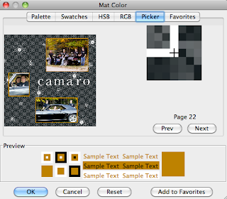
For this page I used the Color Picker to choose the color for the mats on the layout. By moving around on the photograph I was able to see the colors as separate pixels and choose a tone from the leaves to mat the pictures.


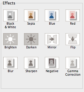
This program even has built-in phot0 effects. I used it to lighten the bottom left photo in this layout that was too dark. (It has not been lightened in this photo but it is lighter on my final draft) This is much faster than having to use a separate photo editing program.


I hope this weeks tips and tutorials have been helpful in highlighting some of the fun things this program is capable of. I have barely scratched the surface, there is so much more. I plan to add more advanced info as time goes on so I hope you are able to check back.


Thursday, January 7, 2010

My Digital Studio features


I was a bit unsure if I really wanted to start digital scrapbooking. I am a fairly new scrapper and was just starting to feel like I knew what I was doing with traditional materials. But I have to say I am sold on this software program. It is so intuitive and easy to use I was able to jump right in. As I spend more time with it, I am delighted with the more advanced things I can do as well.

Today and tomorrow, I am focusing on some very basic features. This page is of my oldest nephew who graduated from medical school this summer and has begun his residency in West Virginia.

The feature of adding mats to all photos at one time was helpful on this page. Very quick. This is in contrast to the February page a few posts back where I wanted the mats to have different colors to make them stand out.


Another feature I used on this page is the ability to rotate text. It is possible to tilt text at any angle.

Next is my daughter's page. She is very active and has many interests.


For this page I again modified a pre-designed layout.
I deleted the four center photo boxes, (I like this layout too - I will have to use it sometime)
then added a larger photo box.
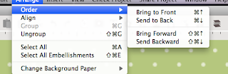
A feature that I use constantly is Arrange-Order-Send back or forward. Here the stamp is behind
while here it is in front. I really like the ability to layer for added interest.


This was a super quick page of flowers from our garden. (I was running out of time to get this project done for Christmas or I would have added a few things.)


If you are really pressed for time there is a feature that will automatically load the pictures for you into one of the pre-designed calendars or albums.


Just choose Autofil and your photos will be placed in the template.

Wednesday, January 6, 2010

MY Digital Studio continued

This calendar page has a few of my parents furry friends and illustrates how to hide a portion of the background that you do not want showing. Notice the heart image near the bottom of the page.


When I first added the heart, it was too big and the center was empty allowing the background paper to show through.

I first resized the heart but did not like the dot in the center.


To hide the dot, I added a circle punch and resized it to fit over the heart.


Using the Color Fill button, I chose the same color as the background paper

then the Arrange -Order-Send Backward function.


This moved the plain colored circle behind the open heart and hid the dotted background paper.


Alternatively, if I had wanted the heart to be a contrasting color, I could have chosen another color to fill the punch with


making a different color heart.


Tuesday, January 5, 2010

Blog Candy Winner and adding paper layers to your layout


The winner of the free pass to UStamp is Dawn from Handcrafted by Dawn! (Random.org #6) Dawn - please email me at bettyt@cablespeed.com and I will get the info to you about your pass. Congratulations - I am sure you will enjoy all the great projects.

Tonight I have just a quick tip for adding designer paper layers without distorting the pattern. This is the calendar page I created in honor of my parents upcoming 50th anniversary. I had 4 photos I wanted to use and none of the predesigned layouts were quite what I wanted, so I easily created my own.

First, I added the background paper. I used Soft Flowers dsp in Basic Black and reduced the opacity to get the shade I wanted.

Next, I added a square punch to the page and resized it into a rectangle.

I filled it with Script dsp in Basic Gray using the Paper Fill button. This allowed me to continue to tweak the size without distorting the paper pattern.

I then added the top photo box, resized it and copied it 2 times to get the exact same size boxes. To make sure they were in a straight line, I used the Arrange - Align - Center functions. It actually was quicker to do than explain it! There are so many helpful little features like this in the program that it is easy to make your pages look great with very little effort.


Tomorrow I have another nifty little trick to share.

Monday, January 4, 2010

More My Digital Studio tips and tricks

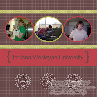
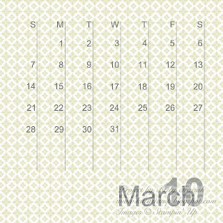
Today I have a few more tips for using My Digital Studio. Here are March's calendar pages. My nephew is a senior at Indiana Wesleyan University so I used their school colors as a starting point.


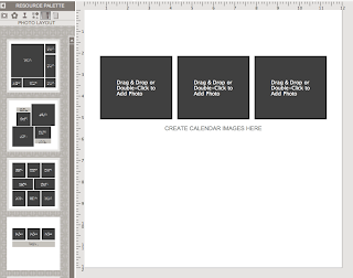
My Digital Studio comes with a nice selection of pre-designed layouts. It is possible to modify these layouts to give more variety quickly and simply. For the top portion, I started with this template.


I clicked on one of the three photo boxes, then on the Photo Shape button found on the right-hand side of the screen.
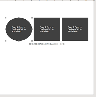
That changed the photo box to an oval shape.

Next, I changed the remaining photo boxes to ovals. This is a simple way to give a different look to layout without starting from scratch.
If you look back at yesterdays post, you will see that I modified the template for the top portion of February as well. I started with this template

and changed the three smaller squares to ovals.
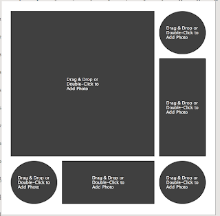

I like to mix shapes on a page to add interest and a circular shape is often helpful in controlling distracting backgrounds so it can serve a two-fold purpose.


Sunday, January 3, 2010

My Digital Studio


My Digital Studio by Stampin' Up is so easy and fun to use. This week I am going to highlight some basic tips and tricks for adding interest to your pages.

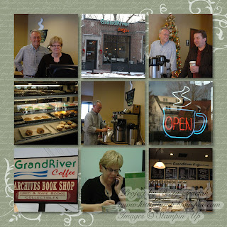
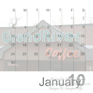
I made a calendar for my parents for Christmas using pictures of my brothers and our family. January has my brother and SIL. They own a great coffee shop. (If you are near East Lansing, Michigan be sure to stop by Grand River Coffee Cafe. I am not a coffee drinker but my husband loves their Mexican roast and our daughter goes nuts over the cappuccino. Now tea is my thing and I love the teas they make using blends from a company in Traverse City.)


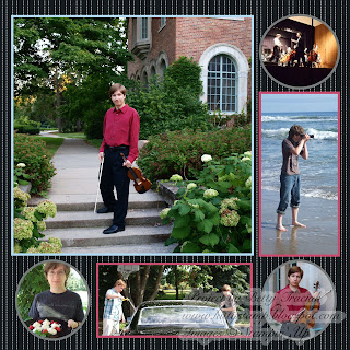
I did a month for each grandchild and February has our middle son Aaron. He is a senior this year and is our family artist. He plays the violin, piano and loves photography.


First, I want to point out how I made the bottom half of the pages. With the calendar grid page open, click on photo layouts in the left hand column. Scroll all the way to bottom and double click on the very last layout (the 12 x 12 picture).


The screen will now look like this. The calendar grid will be completely covered by the photo box.


Next, add the photo of your choice. Then on the right hand side, move the opacity slider to 30%. As you lighten the opacity, the calendar grid will reappear.


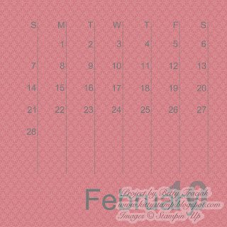
For the calendar portion of February, rather than add a photo I added designer paper as a background layer and reduced the opacity to 75%. (If you decrease the opacity of red too much it becomes pink.)

Adding color and photos to the bottom half of a calendar is a great way to pull the top and bottom together making it look like a larger cohesive layout.

Friday, January 1, 2010

Time for a Tea Party


My project is up on UStamp! Everything you need for a tea party is included - tea bag pack, honey stick holder, cookie wrap and chocolate bag. It uses the pretty stamp sets Dream Garden and Embrace Life and the Throughly Modern designer paper.


There are four coordinating cards with a holder as well. There is still time to comment on the previous post to be eligible to win a free pass to the next UStamp session. I have my project all done for the Valentine session. Of course I am a bit biased but I think it is super-duper cute!